DigitalCreatives
← All projectsCase study / 03

amisi.co

A portfolio that becomes part of the work.

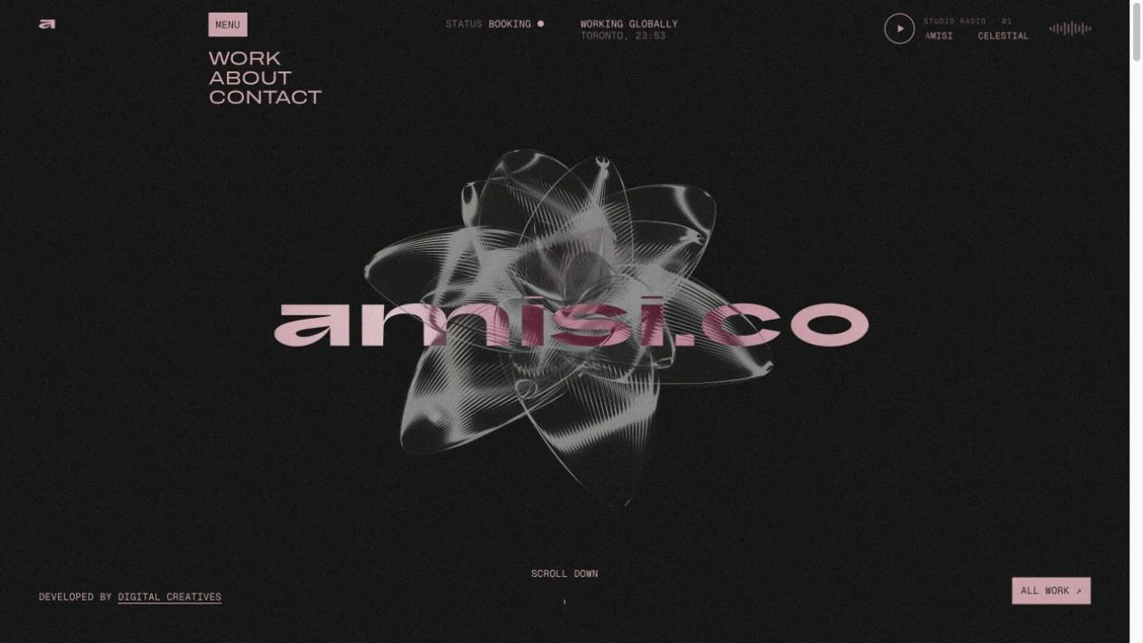
An expressive portfolio where visitors can discover a creative point of view and examine the details behind it. We brought web design and development together to make the collection itself the interface.

amisi.co website design
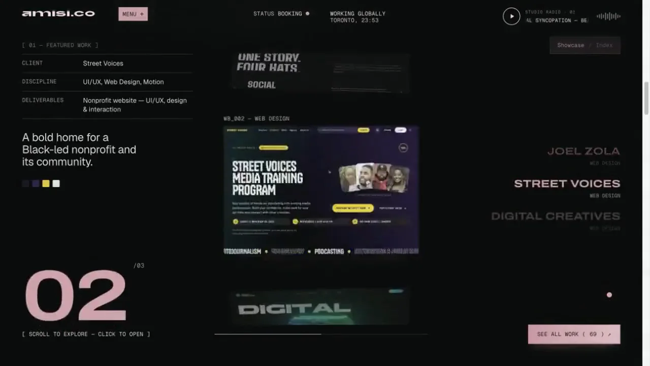
A still from the featured Showcase. Watch the project collection in motion in the recording below.

Discipline

  • Creative direction
  • Web design
  • Web development

Made for

Potential clients, collaborators and creative partners

The visitor journey

Discover the work → inspect a project → start a conversation

[ 01 ] The brief

Express a practice without hiding the work.

A creative portfolio has to communicate a distinct point of view and help someone understand the practice behind it. For amisi.co, the work spans identities, cover art, editorial, digital projects and campaigns. We needed a visual system with enough room for experimentation and enough structure for visitors to examine individual pieces.

A varied collection can be difficult to communicate through a conventional grid alone. One visitor may want an immediate impression; another may be looking for a specific example of branding or a better understanding of a project’s scope. We approached those as different browsing needs, with an expressive first encounter and direct routes into the details.

[ 02 ] Strategy

Two ways in. One connected collection.

We organised the featured work around two complementary modes. The Showcase gives selected projects a sense of scale and sequence, while the Index provides a more direct way to navigate the same selection. Visitors can choose between visual discovery and a purposeful scan without learning a different content structure.

A separate Work archive extends that approach across the wider collection, with category controls to narrow the focus. This provides several useful levels of detail: an immediate impression of the practice, a concise project overview and a closer look at the work. The interface follows the visitor’s intent rather than forcing one way of browsing.

[ A closer look ]

A collection worth exploring.

Move from featured projects to the separate Work archive, then into the practice and enquiry sections. These views from the website recording show how browsing, context and contact work together.

[ 02 / 04 ] Work page / Filters and collection

Make the wider archive easier to navigate.

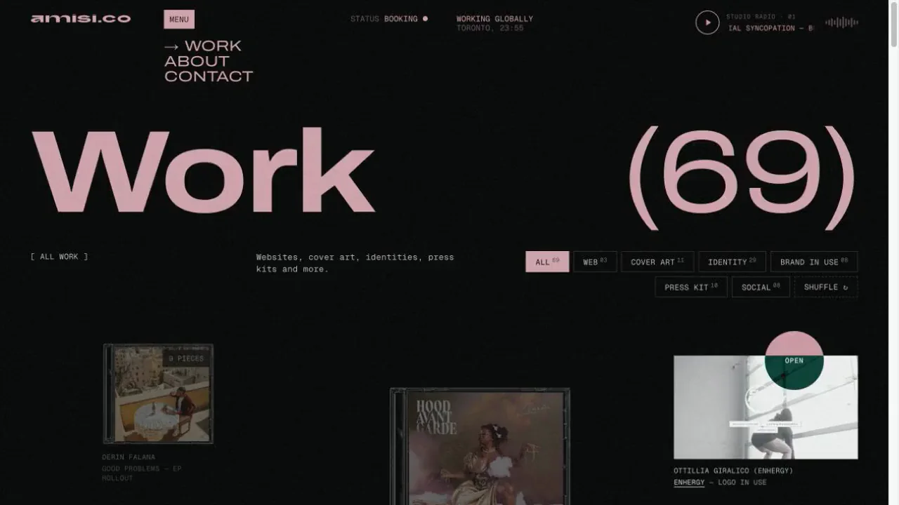
The Work page is a separate destination for the broader collection. A large title and visible item count establish its purpose immediately. Filters distinguish Web, Cover Art, Identity, Brand in Use, Press Kit and Social, allowing someone to narrow the collection to the evidence most relevant to a potential brief.

The images sit in a varied grid rather than a uniform wall of matching thumbnails. Different proportions give posters, screens, covers and other formats appropriate space, while captions identify the work. Selecting a category changes both the visible collection and its count; a shuffle option offers another way to explore. This combination preserves the character of a creative archive while giving visitors practical control over what they see. The page closes with a direct route to an enquiry.

Open the Work archive ↗ (opens in a new tab)
Amisi Work archive with discipline filters and a varied arrangement of project images
Recorded view of the separate Work page, showing discipline filters, an item count and the opening of the archive.

[ 03 / 04 ] About / The practice

Connect the collection to the person behind it.

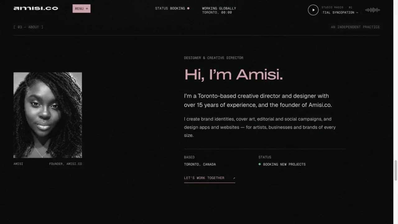
After the moving projects and the wider archive, the About section slows the pace. A monochrome portrait sits beside a direct greeting and a concise introduction to the practice. Pink type and the dark background carry the site’s identity into a calmer composition, allowing the person behind the work to become the focus.

The supporting information is organised around useful questions: where the practice is based, what it does and how to begin a project. A short description connects branding, cover art, editorial, social campaigns and digital design. Further practice information develops those disciplines without asking visitors to infer the whole offer from images alone. The section gives a prospective collaborator context after they have had a chance to form their own impression of the work.

Meet the practice ↗ (opens in a new tab)
Recorded Amisi About section with a monochrome portrait, pink greeting and description of the creative practice
Recorded About view: portrait, introduction and practice information bring a personal context to the work.

[ 04 / 04 ] Contact / Starting a conversation

Finish with an invitation that is easy to act on.

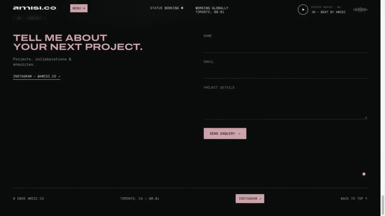
The Contact section turns the portfolio into a starting point for new work. A large invitation sits beside three fields: name, email and project details. That simple structure leaves room for visitors to describe a brief in their own words after exploring the practice. The pink send control draws attention to the next action within the restrained dark layout.

The section also provides an email route and social context, with the footer kept secondary to the enquiry. Its role is different from the animated Showcase or the filterable archive, so the composition becomes more direct. Across the site, the journey moves through a distinctive first encounter, a closer look at the collection, an introduction to the practice and a clear invitation to get in touch.

Visit the enquiry section ↗ (opens in a new tab)
Recorded Amisi Contact section with a project invitation beside name, email and project details fields
Recorded Contact view: a project invitation and concise enquiry fields close the journey from discovery to conversation.

[ 03 ] Design decisions

Let the work carry the colour.

A restrained interface gives project imagery space. Large typography establishes the studio’s presence, while smaller labels identify clients, disciplines and deliverables. The featured images move through a dimensional, rotating composition, with the surrounding information changing as the active project changes. Context stays beside the work rather than becoming a separate explanation to hunt for.

The identity collection has its own rhythm. Logos and wordmarks form a separate visual index, with colour revealed through interaction. Giving identity work a consistent presentation makes it possible to compare different expressions of the practice without forcing every logo into the same full project format.

[ 04 ] Development

Make the browsing modes work as one system.

We built the featured sequence, index and detail views around a shared collection of project content. Changing the selected project also changes its descriptive information. Opening a project reveals a detail sheet with its title, scope and relevant imagery, gallery or recording. Visitors can continue to the next project from that view or return to the collection.

Image lightboxes support closer inspection. Responsive layouts adjust the composition for smaller screens, and motion preferences influence how the presentation behaves. Smaller image variants and lazy-loaded gallery images support a visually dense portfolio without requiring every full-size asset at the beginning of the visit. Escape-to-close behaviour gives the detail views a familiar keyboard route back.

[ 05 ] The delivered experience

A point of view you can explore at your own pace.

The finished website combines an animated introduction, featured projects, a work archive, identity collection, studio profile and contact route. The experience gives someone room to explore visually, then switch to a more direct view when they want to find a particular kind of work or read its context.

The result is a portfolio that demonstrates a creative point of view through its behaviour as well as its content. Its expressive presentation and practical browsing tools support the same purpose: moving from a distinctive first impression toward a clearer understanding of the practice and an invitation to begin a conversation.

[ In motion ]

Explore the experience.

A recorded walkthrough of the website. Press play to watch, or open the live site to explore it yourself.

Next case study

Street Voices

Your only limit is your imagination.

What could we build for you?

Start a project →

Thinking about your next website…

Website detail