DigitalCreatives
← All projectsCase study / 01

Street Voices

A clear identity for a platform with a bigger purpose.

A brand and website experience connecting community storytelling, practical support and creative work. We brought a broad mission into focus through a recognisable identity and distinct routes into the platform.

Street Voices website design
A still from the recorded website showcase, including the creative-agency presentation. The live Street Voices destination also includes its established services directory. Watch the recording below.

Discipline

  • Brand strategy
  • Visual identity
  • Website experience

Made for

Community members, program participants and partners

The visitor journey

Understand the mission → choose a path → explore a resource or project

[ 01 ] The brief

One mission. Several reasons to visit.

Street Voices is a Black-led nonprofit whose work spans community media, youth training and access to free programs and services. That breadth is central to its identity. Someone might arrive looking for a resource, discovering a workshop, reading a story or learning about the organisation behind it. The website has to make those purposes understandable without reducing the organisation to a single service.

A directory calls for direct, functional navigation. A media platform needs room for stories, imagery and personality. The organisation also needs to explain its own work and give partners a reason to explore further. We approached that as a communication and identity challenge: a clear brand for the whole platform, with useful entry points for different visitors.

[ 02 ] Strategy

Organise around what people came to do.

We frame the experience through distinct visitor intentions. Finding support, exploring programs, reading news and understanding the organisation are separate starting points. The mission connects them, but every screen does not need to carry every message. Clear labels and a consistent identity give people a way to orient themselves before going deeper.

The creative-agency presentation introduces another side of Street Voices through work and visual storytelling. Giving that offer its own space allows a prospective partner to explore creative capabilities while retaining a connection to the wider organisation. The principle is continuity without sameness: one recognisable voice, expressed through several useful experiences.

[ A closer look ]

One identity. Several destinations.

Explore the directory, program and agency pages from the recorded website showcase. Each serves a different visitor need within the same identity; the live public directory is a separate destination.

[ 01 / 06 ] Directory / finding support

Start with a practical question.

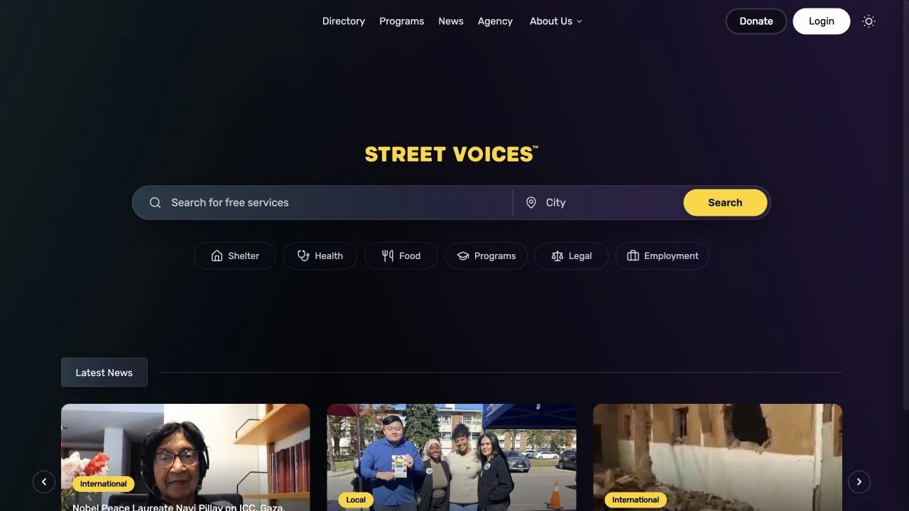
The directory opening puts the task before the organisation’s story. A service search and a city field sit together in one prominent bar, followed by shortcuts for Shelter, Health, Food, Programs, Legal and Employment. Someone can begin with a specific need or choose a category when they are still working out what to search for. The bright search button supplies a clear endpoint to that first decision.

The page also makes room for the wider platform. News appears below the functional introduction, and the persistent navigation connects the directory to programs, news, agency work and organisational information. That separation matters: visitors seeking immediate support can start directly, while someone discovering Street Voices has visible routes into its other work. This is the wider directory context in which the identity and website presentation operate.

Visit Street Voices ↗ (opens in a new tab)
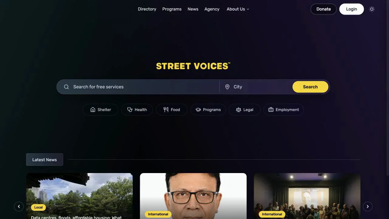
Street Voices search with service and city inputs and six category shortcuts.
Directory search in the recorded website showcase.

[ 02 / 06 ] Directory / results

Make a result useful before the next click.

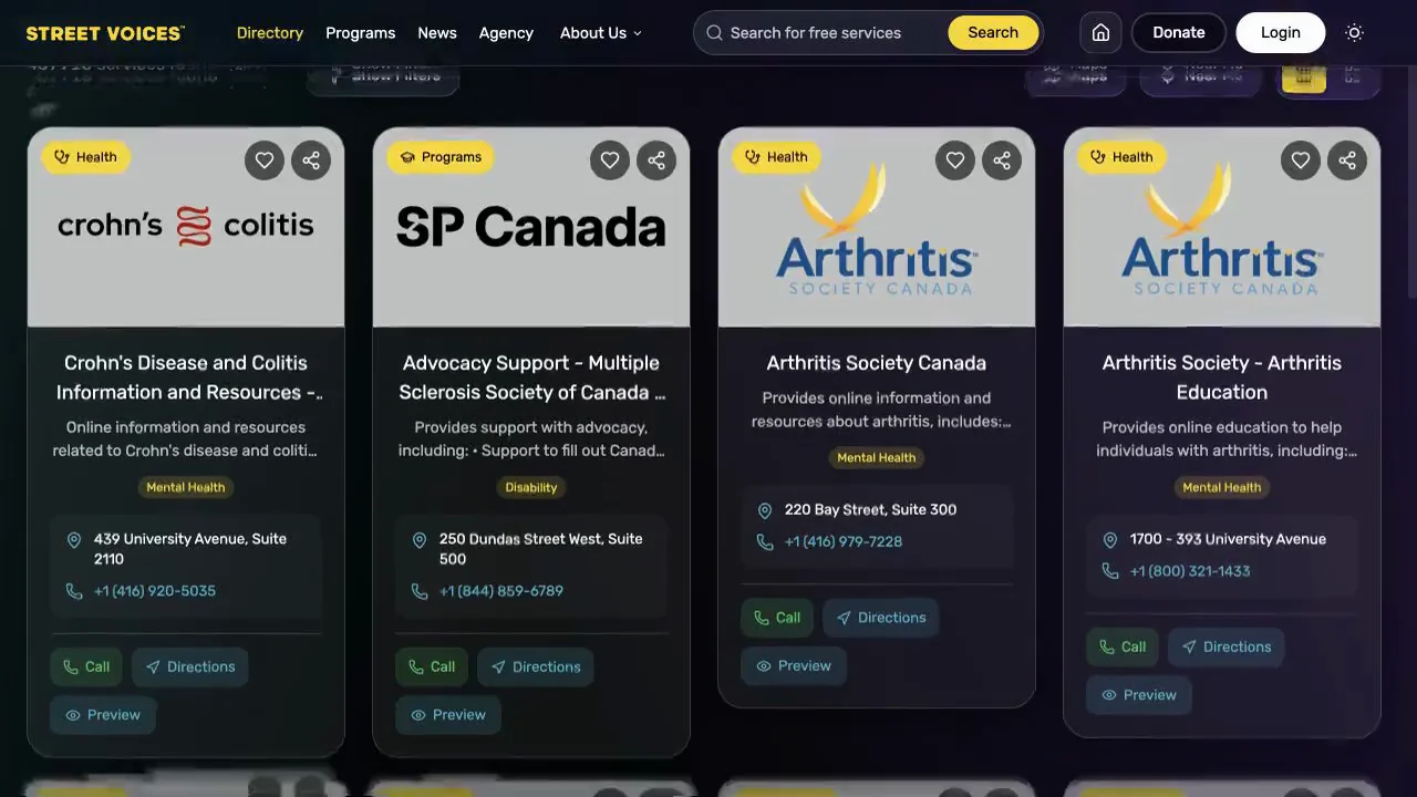
The result cards repeat a compact hierarchy: category, organisation, short description, topic tag and practical contact information. The consistent shape lets visitors compare options without relearning the layout for every provider. Logos identify each organisation, while the surrounding dark interface and yellow category accents keep the collection connected to Street Voices.

Call, Directions and Preview are presented at the card level. They correspond to different next steps: contacting a provider, locating it or inspecting more information. Saving and sharing controls sit above that information rather than interrupting the main reading path. Consistent labels, spacing and emphasis connect those individual decisions to the wider directory experience.

Visit Street Voices ↗ (opens in a new tab)
Street Voices directory cards with category labels, provider names, descriptions, contact details and action buttons.
Service-result cards in the recorded website showcase.

[ 03 / 06 ] Programs / media training

Give a program its own clear invitation.

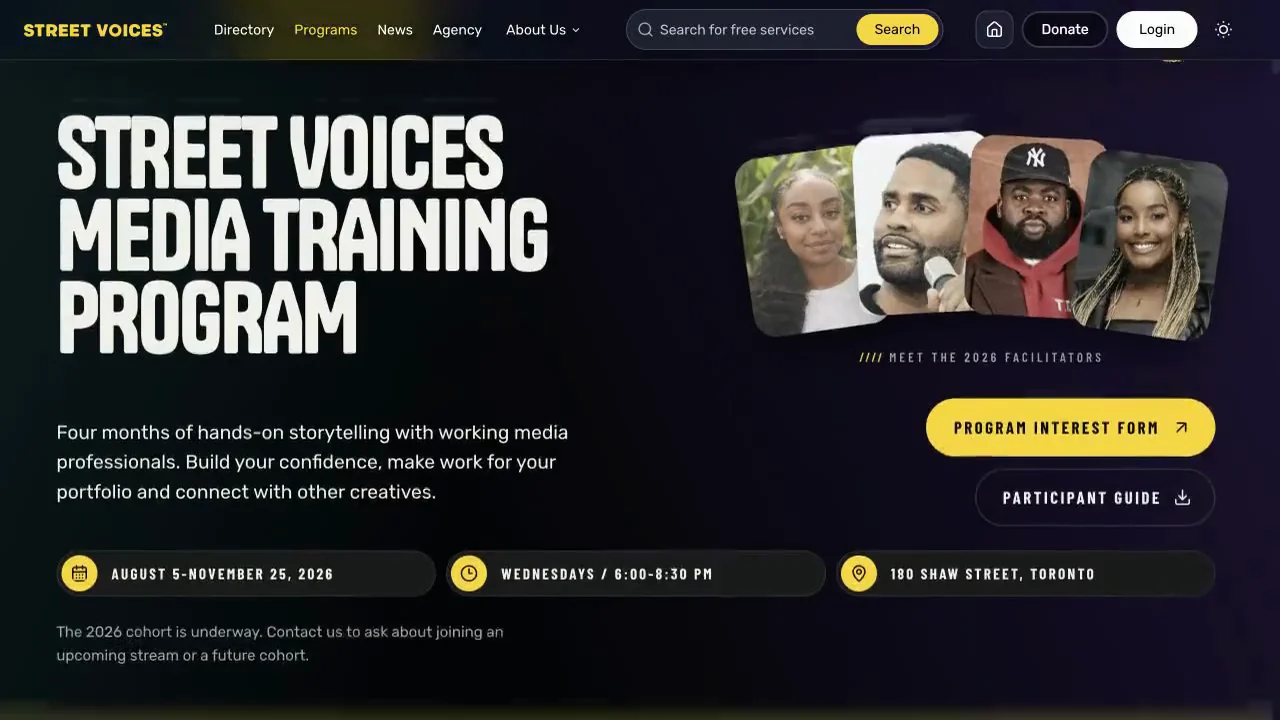
The program page changes the emphasis from searching to understanding an opportunity. An oversized headline immediately names the offer, while the neighbouring portrait arrangement introduces the people involved. A short explanation describes the experience in ordinary language before the visitor reaches the practical information. The interest form is the most prominent action; the participant guide is a quieter alternative for someone who needs more detail first.

Timing and location appear as three distinct information blocks beneath the introduction. This is a different content hierarchy from the directory, but it uses the same yellow accent, dark foundation and direct typography. The organisation remains recognisable while the page answers the questions specific to a prospective participant: what is it, who is involved, when does it happen and how do I express interest?

Visit Street Voices ↗ (opens in a new tab)
Media training introduction with facilitator portraits, interest form, guide and schedule information.
Media Training Program page from the recorded website showcase.

[ 04 / 06 ] Programs / learning journey

Turn a timetable into something you can scan.

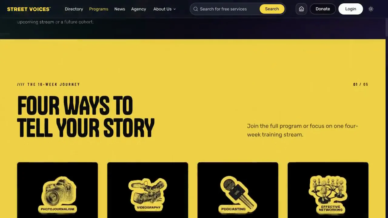
A full yellow section marks a change from the invitation into the structure of the program. Four illustrated cards identify Photojournalism, Videography, Podcasting and Effective Networking. Each subject receives its own recognisable symbol, giving the visitor a visual overview before they read the detailed stream information.

The composition makes progression visible without relying on a long schedule paragraph. It can explain a broader program and its individual parts in the same view. The contrast with the dark introduction gives this practical section an editorial pause, while the condensed typography maintains continuity with the opening. The result is a page that moves from a first impression into a clearer understanding of the experience being offered.

Visit Street Voices ↗ (opens in a new tab)
Yellow program section showing photojournalism, videography, podcasting and effective networking cards.
The training journey section within the recorded Programs page.

[ 05 / 06 ] Agency / selected work

Let the creative offer be seen in the work.

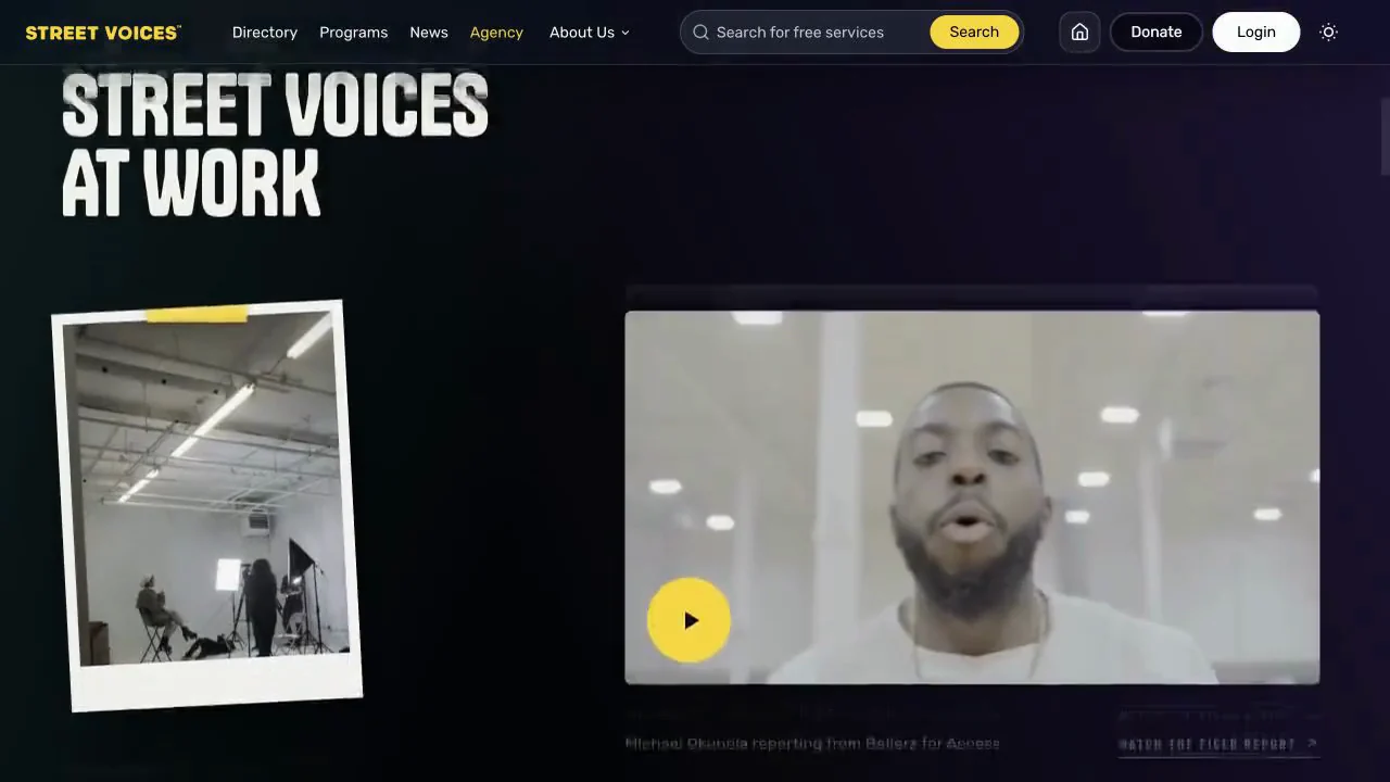
The agency presentation shifts from describing capabilities to showing examples. A behind-the-scenes studio photograph sits alongside a larger field-report video, giving the media different weights within the composition. The photograph suggests the making of the work; the larger playback area provides a route to the work itself. Captions and direct links give each image context and a next step.

This is how the creative side of Street Voices can sit beside its community mission without becoming a disconnected brand. The familiar header and palette remain in place, while the page makes more room for photography, reporting and storytelling. A partner can explore tangible examples instead of being asked to infer the offer from a list of creative services alone.

Visit Street Voices ↗ (opens in a new tab)
Street Voices agency page pairing a behind-the-scenes studio photo with a field-report video.
Agency work section from the recorded website showcase.

[ 06 / 06 ] About / organisational story

Connect the present platform to its origins.

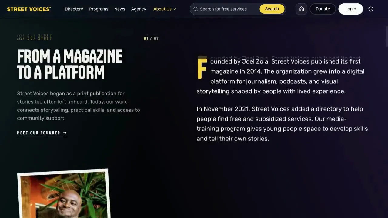
The organisational story uses a calmer, text-led composition. A concise headline and introduction occupy the left column, while a larger text block develops the account on the right. The highlighted initial letter, restrained labels and supporting photography keep the reading experience connected to the visual identity without competing with the story.

The section gives the range of the platform a shared origin: a publication that developed into broader media work and practical community resources. The founder link is a separate route for someone who wants to go further. For a partner or first-time visitor, this layer of context explains why news, training and services belong together, complementing the task-focused directory and the invitation-led program pages.

Visit Street Voices ↗ (opens in a new tab)
Street Voices About page explaining the progression from magazine to platform in a two-column editorial layout.
About page from the recorded website showcase.

[ 03 ] Design decisions

A bright identity on a dark foundation.

The recorded showcase pairs a dark foundation with a bright yellow brand, direct typography and prominent images. Yellow provides recognition and emphasis, while the darker background gives photographs, project content and headlines room to stand out. Large type makes the introduction immediate; supporting labels help practical information remain legible.

The identity needs to connect very different content. A community story, a program and a creative project should still feel part of the same organisation. Repeating the visual language provides that connection without forcing every item into one layout. The design gives imagery space to carry the story and keeps navigation separate from the expressive moments.

[ 04 ] Website experience

Give each intention a usable next step.

Street Voices’ live directory includes service and city searches, category filters, listing profiles and a map view. These establish the wider product context: someone seeking support needs understandable labels, useful details and a clear route from a broad search to an individual service. The brand experience must sit comfortably beside those practical tasks.

Our part of the project centres on brand strategy, visual identity and website presentation around the wider platform. Our priorities are legible navigation, screen-aware composition and a clear relationship between content and destination. The recorded showcase demonstrates how project imagery, headlines and brand elements work together as a website experience.

[ 05 ] The delivered experience

A connected presence with room for the whole organisation.

The result is a website presence able to express both Street Voices’ community purpose and its creative capabilities. A consistent identity connects the different parts of the experience, while distinct entry points let visitors choose a relevant route. Someone learning about the organisation can explore its work; someone seeking support can continue toward the directory.

For us, the useful outcome is clarity. The work shows how brand strategy and website design can bring a complex organisation into focus without flattening the range of work it does. The showcase and live platform offer complementary views of that identity in use.

[ In motion ]

Explore the experience.

A recorded walkthrough of the website. Press play to watch, or open the live site to explore it yourself.

Next case study

Joél Zola

Your only limit is your imagination.

What could we build for you?

Start a project →

Thinking about your next website…

Website detail