DigitalCreatives
← All projectsCase study / 02

Joél Zola

An editorial presence with a clear next step.

A personal website connecting the work of a social entrepreneur, speaker, programmer and consultant. We paired a distinctive visual voice with practical routes for organisers, collaborators and the press.

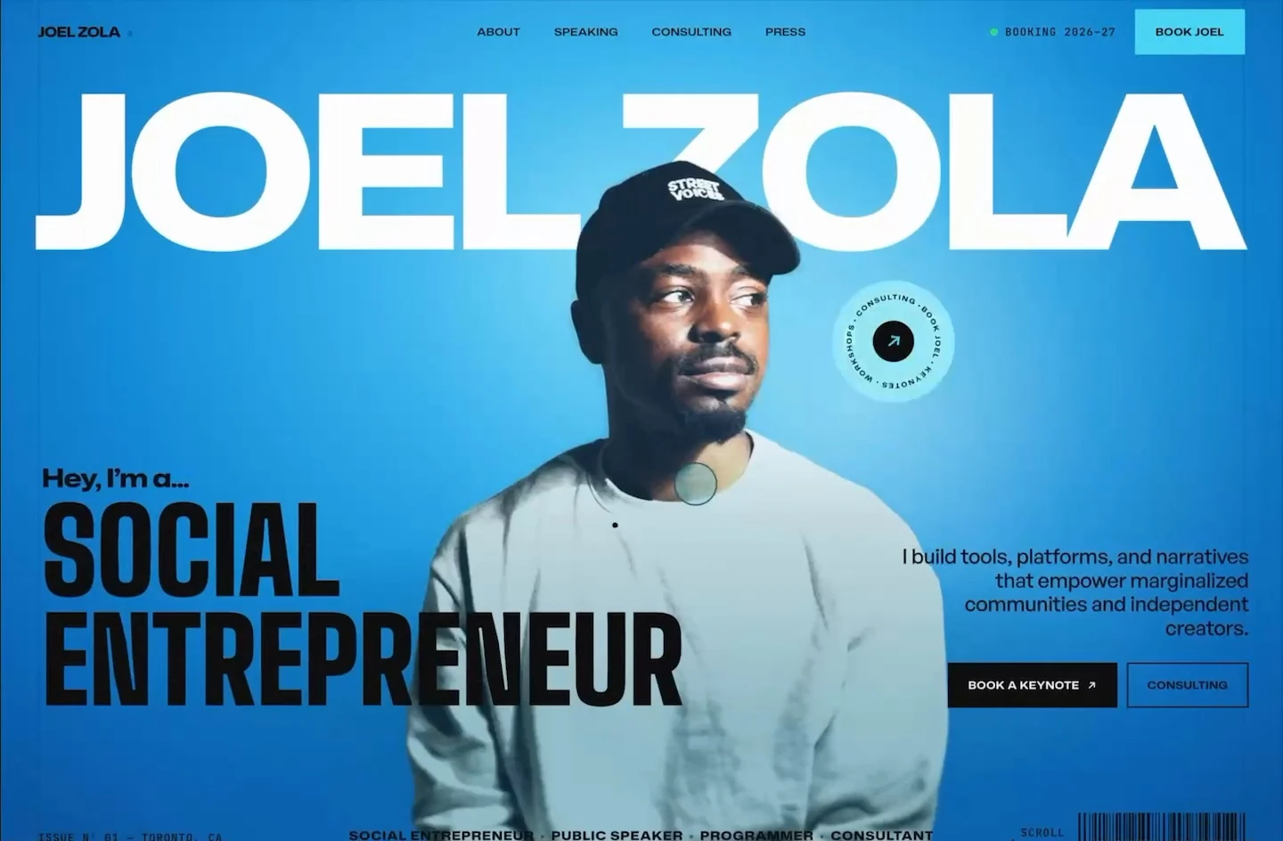
Joél Zola website design
A still from the website walkthrough, showing the vivid blue editorial identity. Watch the recording below.

Discipline

  • Brand strategy
  • Web design
  • Web development

Made for

Event organisers, consulting prospects and journalists

The visitor journey

Meet Joél → explore an offer → make a relevant enquiry

[ 01 ] The brief

Connect the person, the story and the offer.

Joél’s work crosses several roles. The website needed to connect them through a coherent personal story while giving visitors clear ways to act. An event organiser needs different information from a consulting prospect or a journalist. We brought those needs into one identity, then gave each audience a route through the site.

A personal website can become either an oversized biography or a collection of disconnected services. This project needed a balance: enough background to understand the person, enough detail to evaluate an offer, and a simple way to start a conversation. The first impression could be expressive without making practical information difficult to reach.

[ 02 ] Strategy

Build the story like an editorial publication.

We organised the site into six main destinations: the cover, About, Speaking, Consulting, Press and Contact. The homepage introduces the different roles, while dedicated pages allow each offer to develop at its own pace. Speaking and consulting receive clear calls to action rather than being buried inside a general introduction.

The editorial idea gives the experience a meaningful foundation. Joél’s story includes the origins of Street Voices as a magazine, so a cover, masthead, issue details and page folios connect the visual language to the subject. The site can feel like a considered publication while still working as a practical professional resource.

[ A closer look ]

Beyond the cover.

Follow the journey through Speaking, Consulting and Contact, including the mobile enquiry layout. Each page gives a different audience the information they need to take the next step.

[ 01 / 04 ] Speaking / Topics and formats

Help organisers evaluate the right talk.

The Speaking page begins with a full-width stage photograph and an oversized title. Two clear actions serve different levels of readiness: check availability or explore the talks. The photograph conveys the setting immediately; the surrounding interface gives an organiser a direct way to investigate the offer.

The signature talks sit in an accordion. Opening one brings its subject, explanation, audience takeaways and format tags into view together. This is a different reading task from the About page, so the information becomes more structured and comparable. A separate formats section describes keynotes, workshops, panels, fireside conversations and virtual events. The progression moves from presence to fit to practical booking details, allowing the site to support an actual programming decision rather than ending at a strong first impression.

Visit the Speaking page ↗ (opens in a new tab)
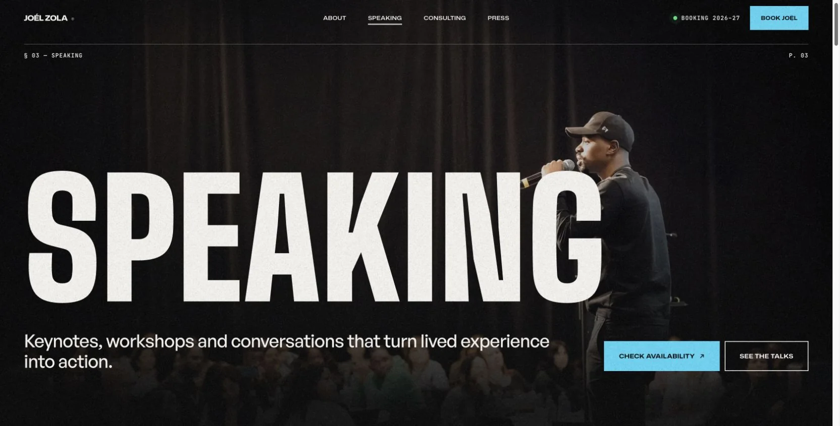
Joél Zola Speaking page with oversized white typography over a stage photograph and availability and talks links
Speaking: a stage photograph and clear calls to action introduce the offer before the topics and formats.

[ 02 / 04 ] Consulting / Service structure

Turn a broad practice into concrete services.

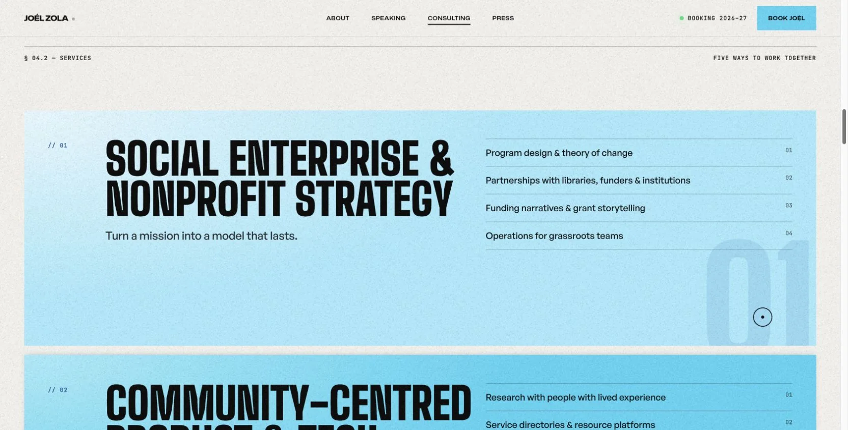
Consulting receives a dedicated page because a prospective project partner needs different information from an event organiser. An ink-dark introduction, large typography and a working photograph establish a professional context. The opening then offers a choice between starting a project and examining the services in more detail.

The service sequence breaks the practice into named areas with supporting activities. Each panel has a number, a substantial heading, a short explanation and a concise list. That repeated structure helps visitors compare areas without flattening them into a generic service menu. The page can explain strategy, community-centred technology and media-related work within one consistent system. Its enquiry link preserves the consulting context when visitors continue to Contact, carrying the purpose of their visit into the next screen.

Explore consulting services ↗ (opens in a new tab)
Joél Zola Consulting page with numbered service areas and specific activities
Numbered service panels connect each consulting area to the kinds of work a prospective client can discuss.

[ 03 / 04 ] Contact / Contextual enquiries

Keep the enquiry relevant to the visitor.

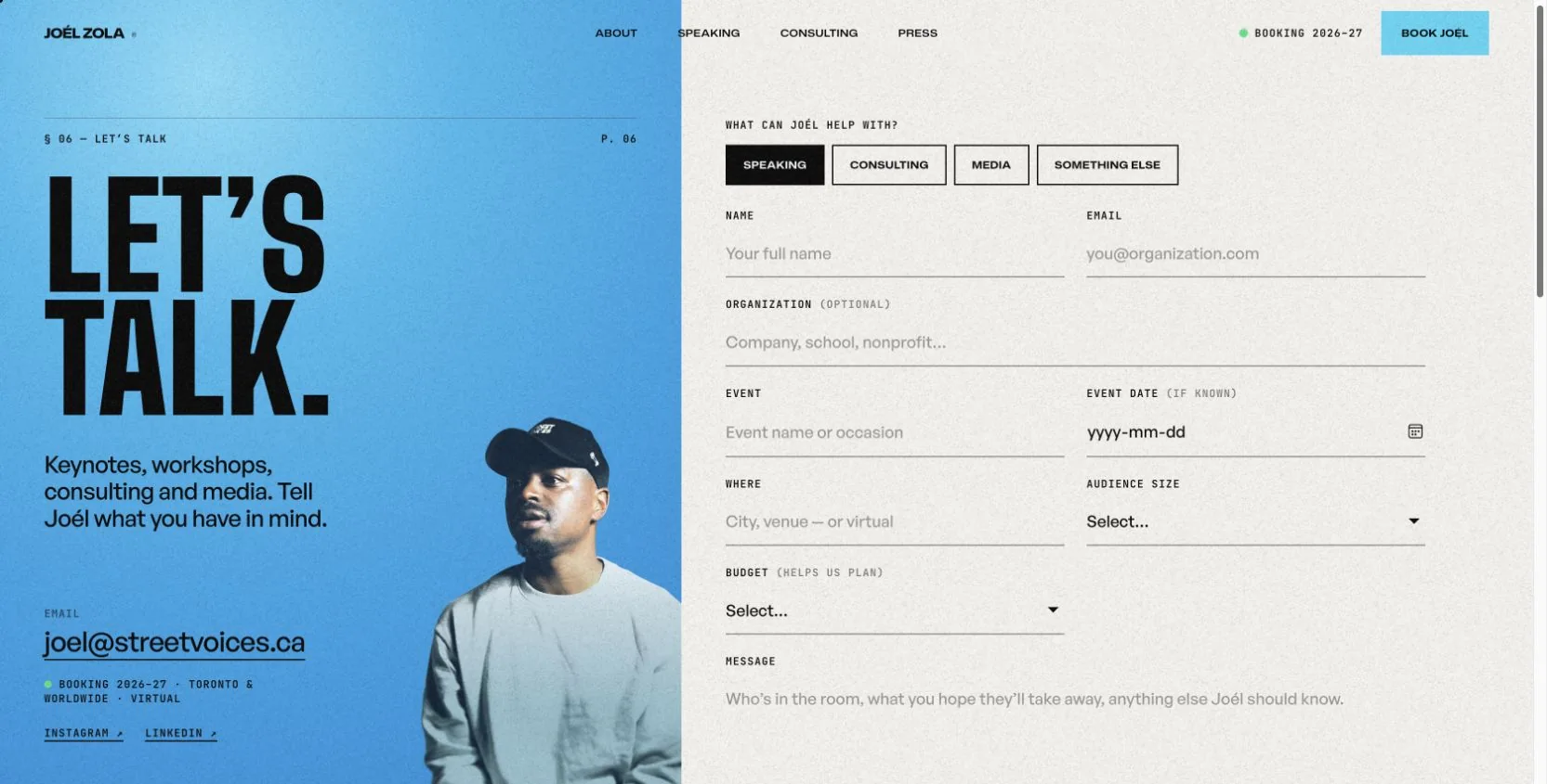
Contact is the point where the separate audience journeys meet. Speaking, Consulting, Media and Something else are presented as explicit choices. Links from the relevant pages can preselect a type, retaining the context of the visit instead of asking someone to explain again why they arrived.

The form then changes with that choice. Speaking can ask about an event, its date, location and audience; consulting can ask about a project and timeline; media can ask about an outlet and deadline. General identity and message fields stay consistent. This keeps the form focused on the conversation being started. The design places these controls beside a clear personal introduction, preserving the character of the site while making the final step straightforward.

Explore the enquiry form ↗ (opens in a new tab)
Joél Zola Contact page with Speaking selected, event details and a blue portrait introduction
The enquiry type changes the fields shown, so an organiser, project partner or journalist can provide relevant information.

[ 04 / 04 ] Mobile / Enquiry journey

Carry the identity onto a smaller screen.

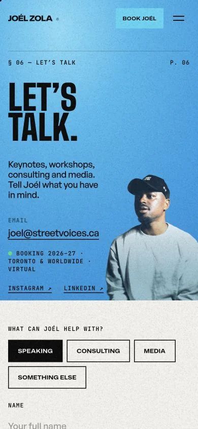
On a smaller screen, the desktop Contact composition becomes a vertical sequence. The blue introduction, portrait and direct email link appear first; the enquiry choices follow on the paper-toned section below. The page keeps its recognisable contrast and typography while giving each part room within the narrower viewport.

The compact header retains a visible booking action beside the menu. The enquiry choices wrap into rows instead of being squeezed into a single line. This is the practical side of the visual system: the same content can move from a wide, two-column arrangement to a readable sequence without losing its hierarchy. The mobile view completes the story of a website built around real journeys, from exploring an offer to providing the details needed for a conversation.

Visit the Contact page ↗ (opens in a new tab)
Mobile Joél Zola Contact page with blue introduction above speaking, consulting and media choices
Mobile Contact view: the introduction stacks above the enquiry choices, keeping the same visual language in a narrower layout.

[ 03 ] Design decisions

Make the first impression unmistakable.

Vivid blue and cyan give the opening energy. Ink and paper tones provide contrast across longer content, while large display type and condensed headlines establish a magazine-like hierarchy. Photography keeps the person at the centre of the composition, with the masthead working around the portrait rather than sitting in a detached banner.

That visual language carries into the service pages and press material. The system becomes calmer and more structured when someone needs to compare an offer, read a biography or find booking information. Keeping the same typographic and colour vocabulary across those different reading modes makes the site feel connected.

[ 04 ] Development

Carry personality and context into the interaction.

The signature portrait uses a frame-based canvas treatment. On desktop, Joél’s head responds to the pointer and keyboard focus. Responsive layouts and reduced-motion handling account for different ways of visiting, so the experience does not rely on everyone using the same device or interaction. Text reveals and page transitions support the editorial direction.

The contact experience carries context into an enquiry. Routes from speaking, consulting and media pages can preselect the relevant type of conversation, while the form adapts to that starting point. The Press page provides fast facts, a copyable biography and downloadable photographs, bringing useful material for organisers and editors into one place.

[ 05 ] The delivered experience

A memorable introduction. A practical professional home.

The finished website connects a personal story, distinct offers and professional resources. Visitors can explore Joél’s background, understand the offer relevant to them, gather press material and send an enquiry. The expressive cover establishes character; the surrounding pages provide the detail needed to take a useful next step.

The project demonstrates what happens when design and development support the same idea. The portrait is part of the identity, contextual links make the enquiry route more relevant, and editorial structure gives a varied body of work a coherent home. The result is both a personal introduction and a working resource.

[ In motion ]

Explore the experience.

A recorded walkthrough of the website. Press play to watch, or open the live site to explore it yourself.

Next case study

amisi.co

Your only limit is your imagination.

What could we build for you?

Start a project →

Thinking about your next website…

Website detail